working with water colour for a concept
This was the initial painting that sparked the idea for a bridge over a waterway.
This felt like water, flowing, dripping. It then stood out as breaks in water, like a bridge, I saw structure and control in this piece at the bottom of the page that took me to my next painting.


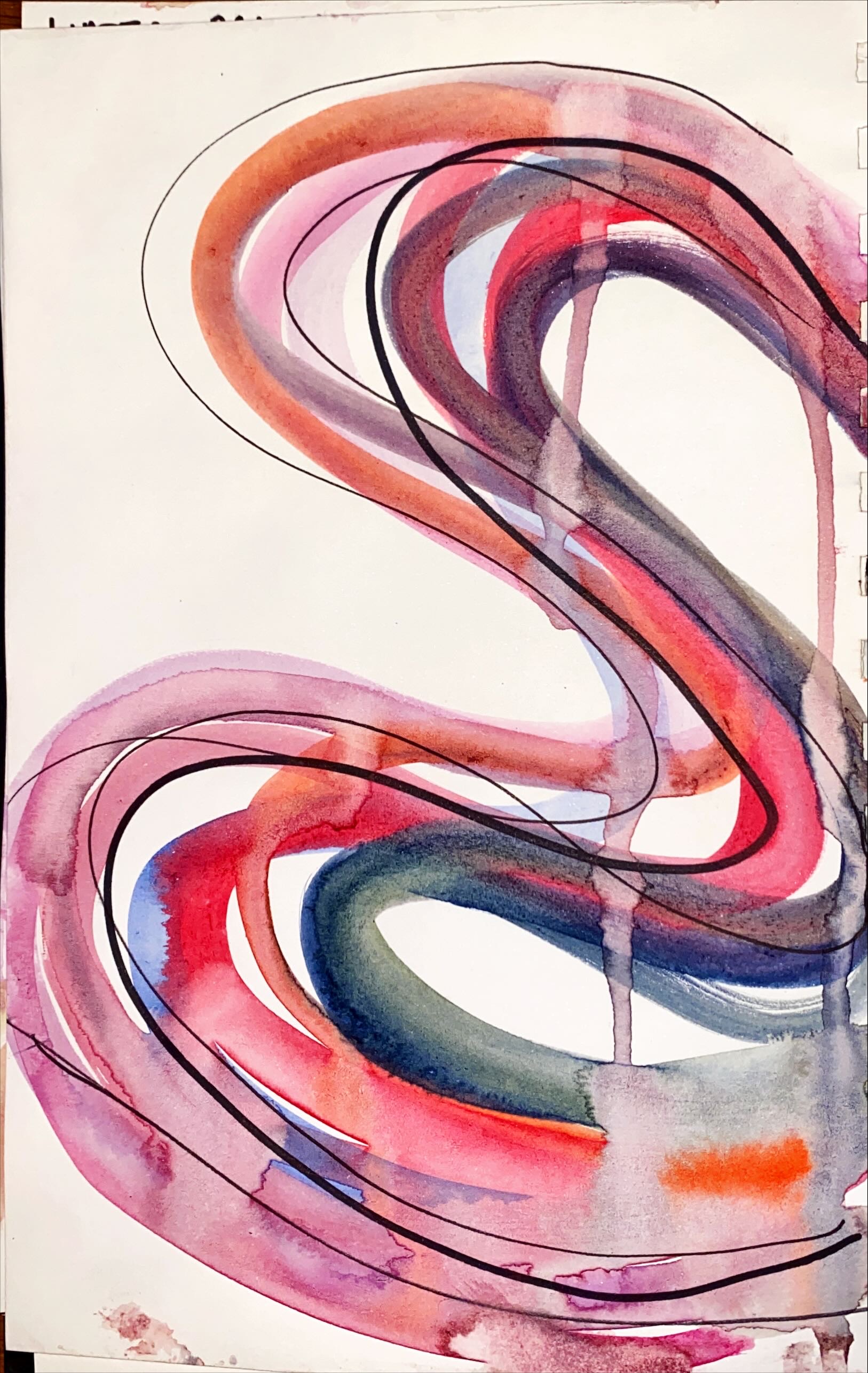
I did this across two pages, which made an interesting study for my sketch book. I took this further by making it really curved and made the piece a lot more controlled rather than letting water take its course. I still used bright colours in here with a few water runs and drips.

This is a bridge that is from a first painting/ sketch. It's a bridge that curves and meanders, almost defeating the idea that it's a convenient way across a river. it's more of a reflection of the form of a river that has meandered round the harder rocks. Ribbons of coloured metal and steel would create an overhead structure. This wouldn't be covered it would just be bright and a bit crazy.
I just really loved the shape here, and how it worked as such natural freeing shape juxtaposed by the structure of the bridge.


Comments
Post a Comment